
Floating Button
Introducing a Floating Button that provides quick access to key actions. This small, interactive button remains fixed on the screen, offering users a convenient way to navigate or perform tasks within the app.
Steps to add Floating Button
1. Enable Floating Button

2. + Add Floating Button

- Click on "Add Floating Button" to move further in creating your floating button.
3. Upload Icon

- Choose an icon for the floating button by uploading an image file. The recommended size is 1024x1024 pixels to ensure optimal resolution.
4. Adjust Background Color

- Select a background color for the button to match your app's design theme.
5. Button Position

- Determine where on the screen the button will be positioned.
6. URL Redirection

- Specify a URL to which users will be redirected when they click the floating button.
7. Select Button Shape

Decide whether the button should have a circular or square shape.
Click on "Next" button to proceed.
8. Configure Display Settings
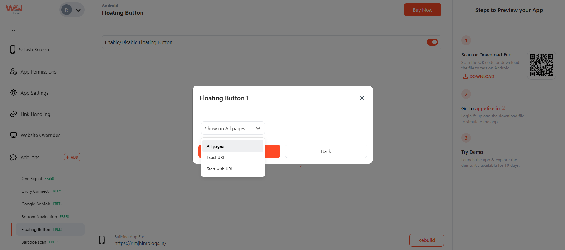
Select the appropriate visibility option based on your app's requirements:
- Show on All Pages: Display the button on all pages of your app.
- Exact URL: Specify the exact URL of the page where the button should appear.
- Start with URL: Display the button on pages that start with a specific URL pattern.
After customizing and configuring visibility settings, click on the "Save" button to apply the changes. "Rebuild" your app to apply and view the changes. The rebuild process may take a few minutes, depending on the complexity of your app.
9. Review and Test After rebuilding the app, thoroughly review and test the floating button functionality to ensure it behaves as expected and appears correctly based on the defined visibility settings.


